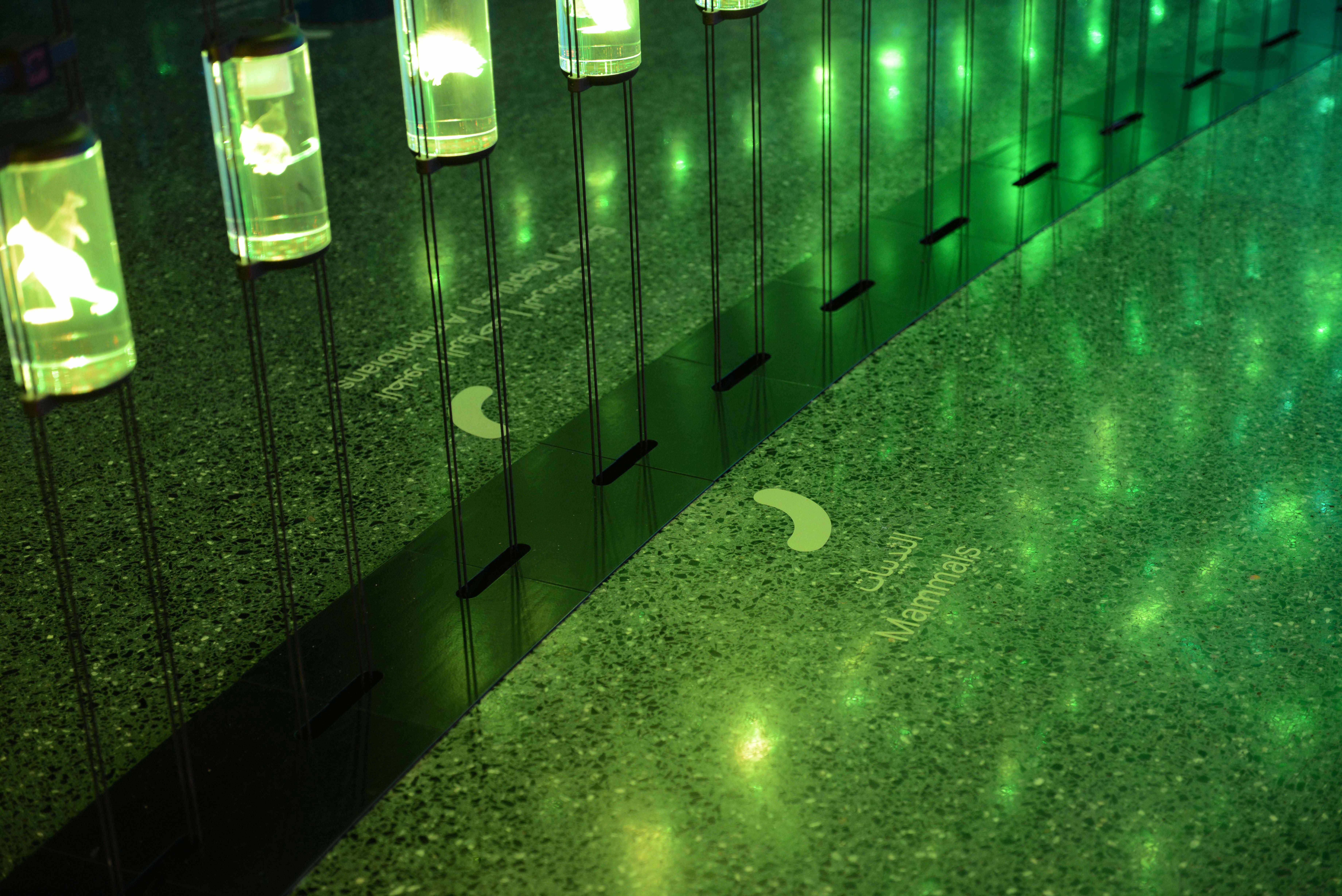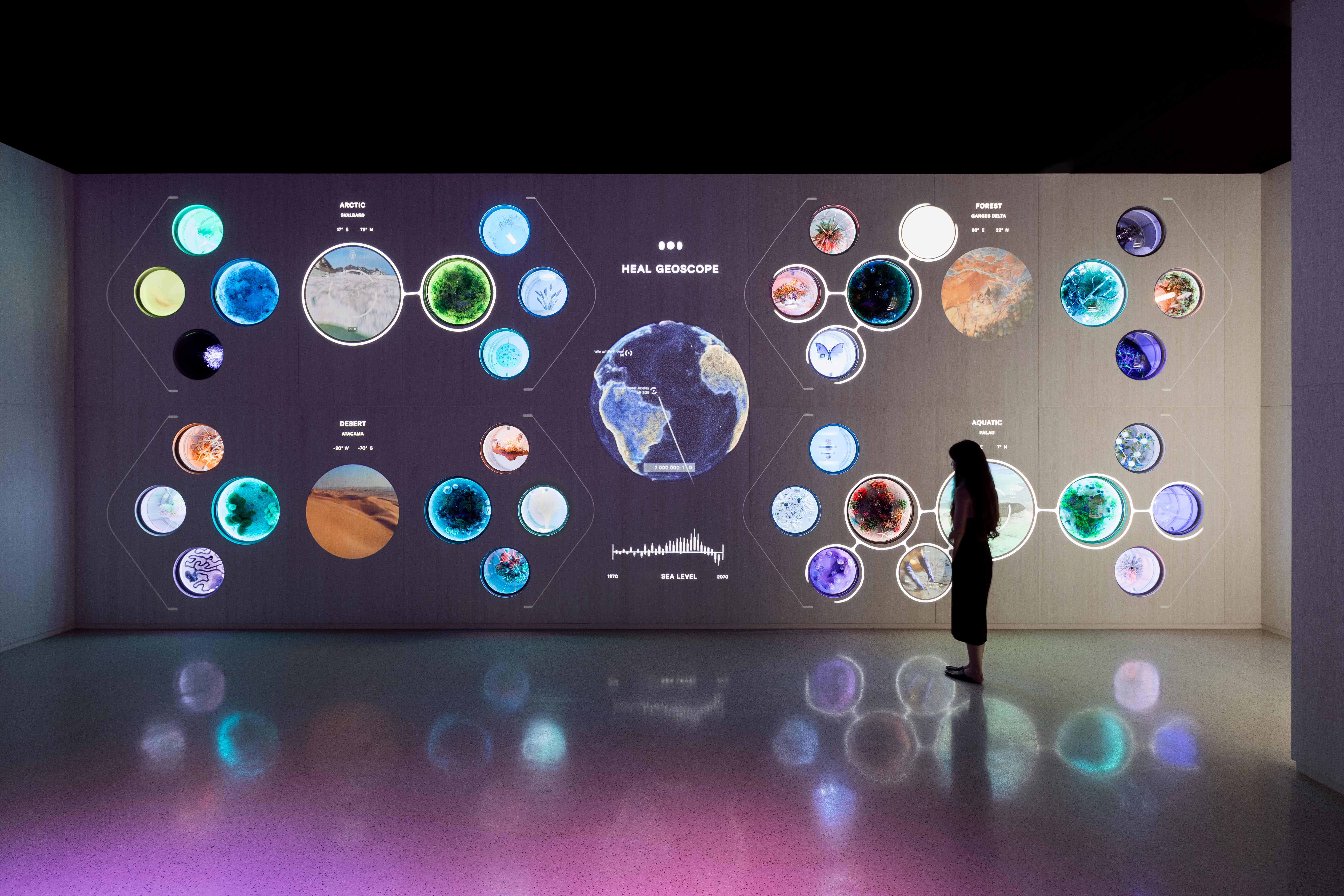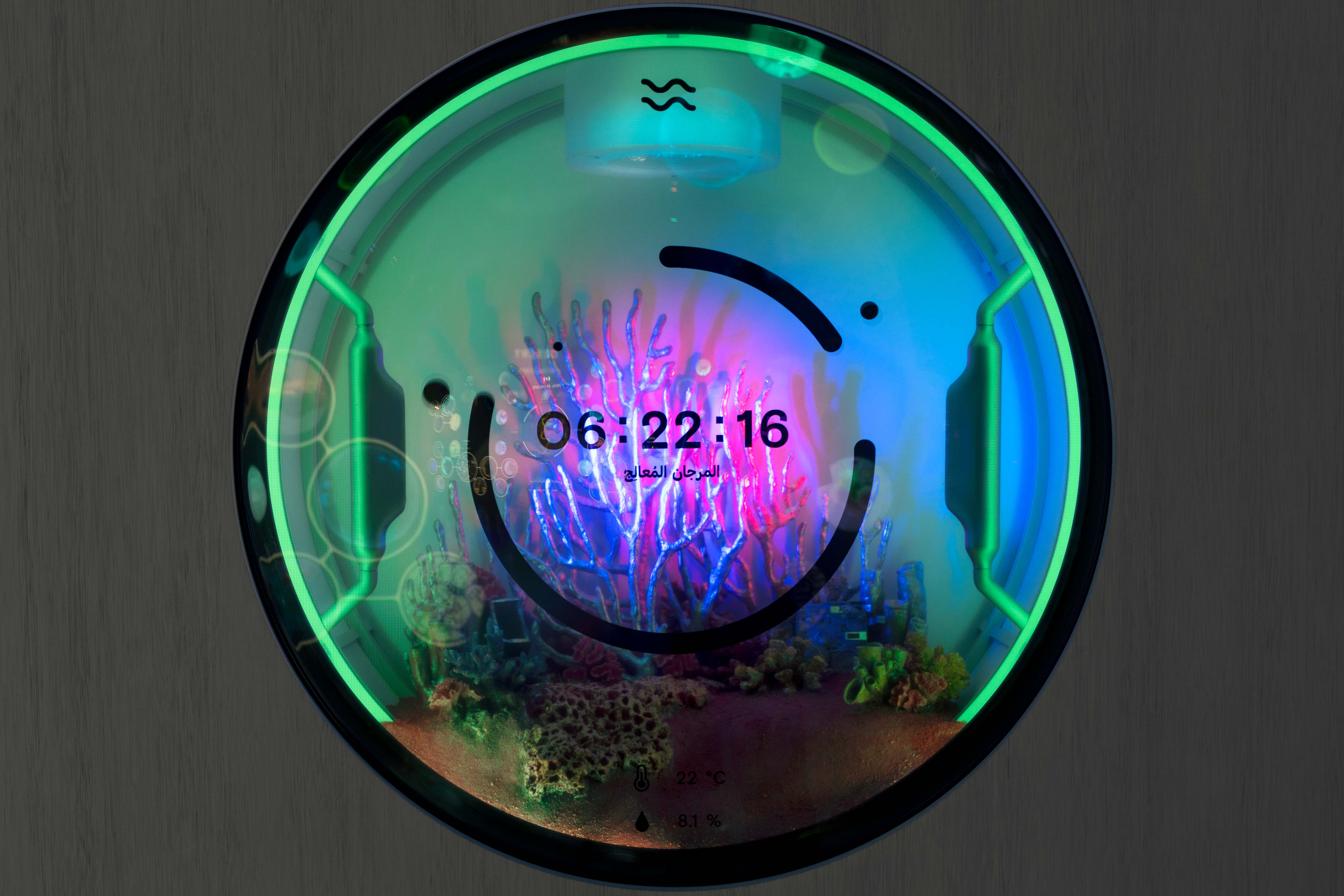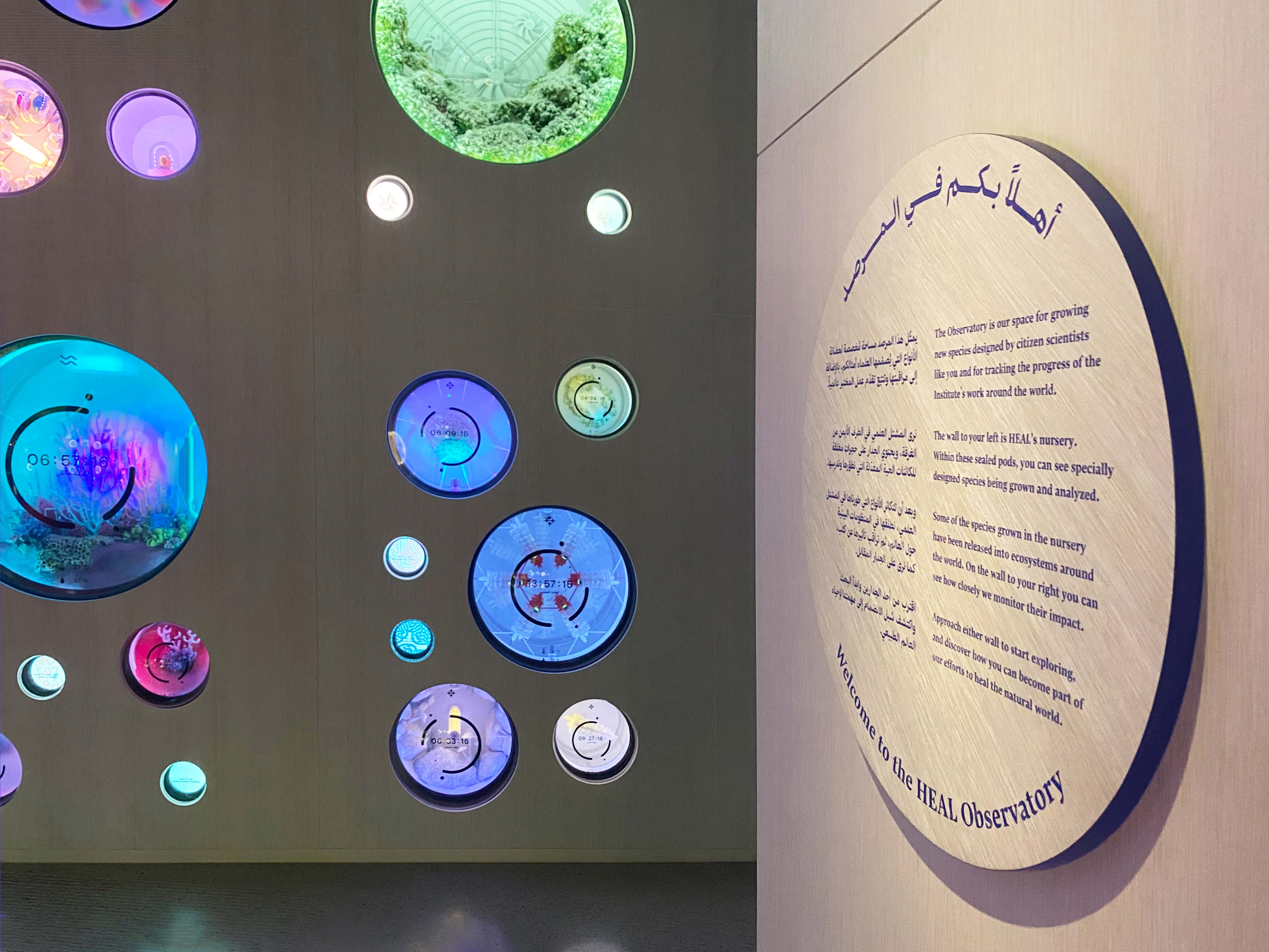
Exhibition Graphics | Sayaka Koike, Sami Karam, Sun Young Oh
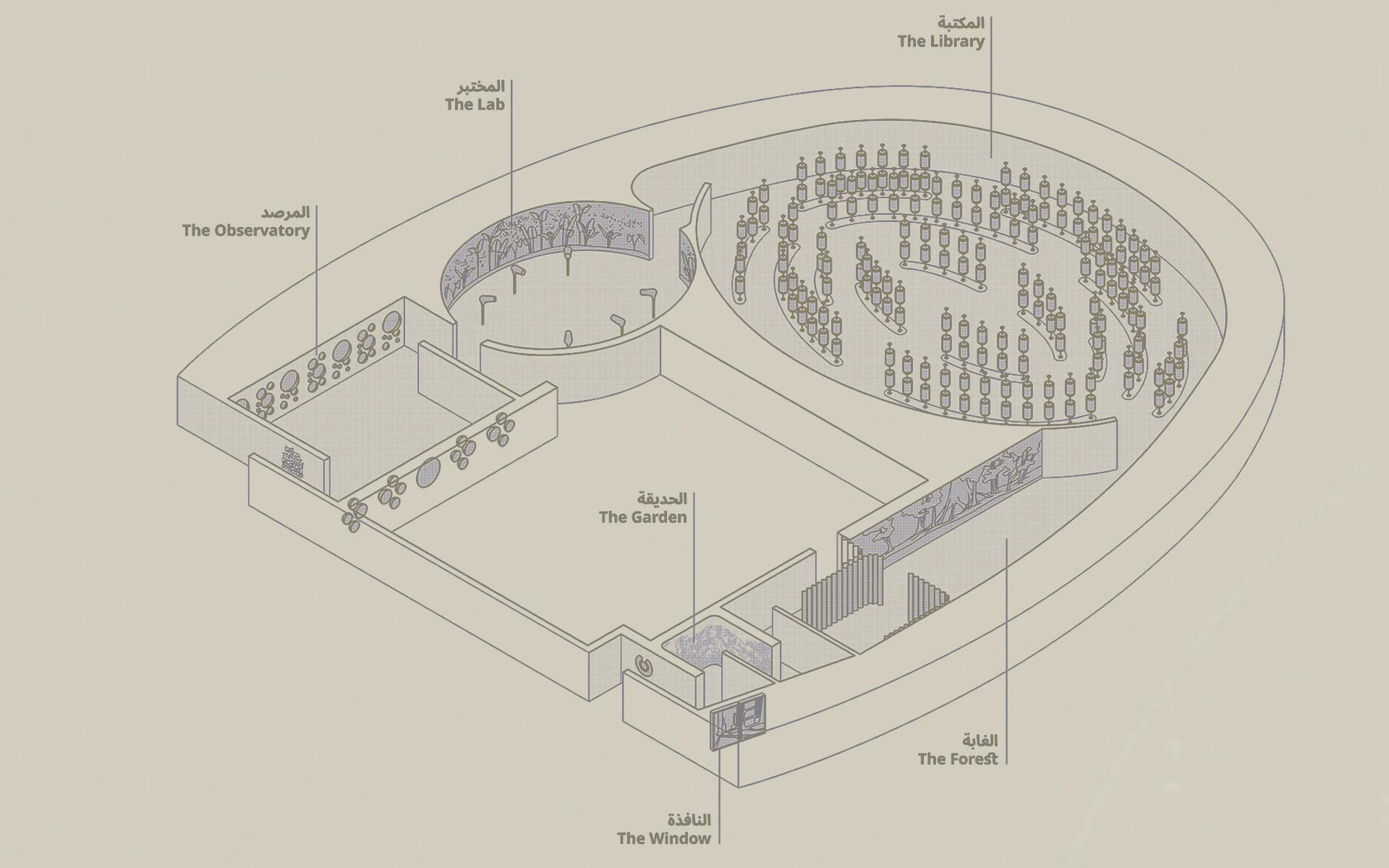
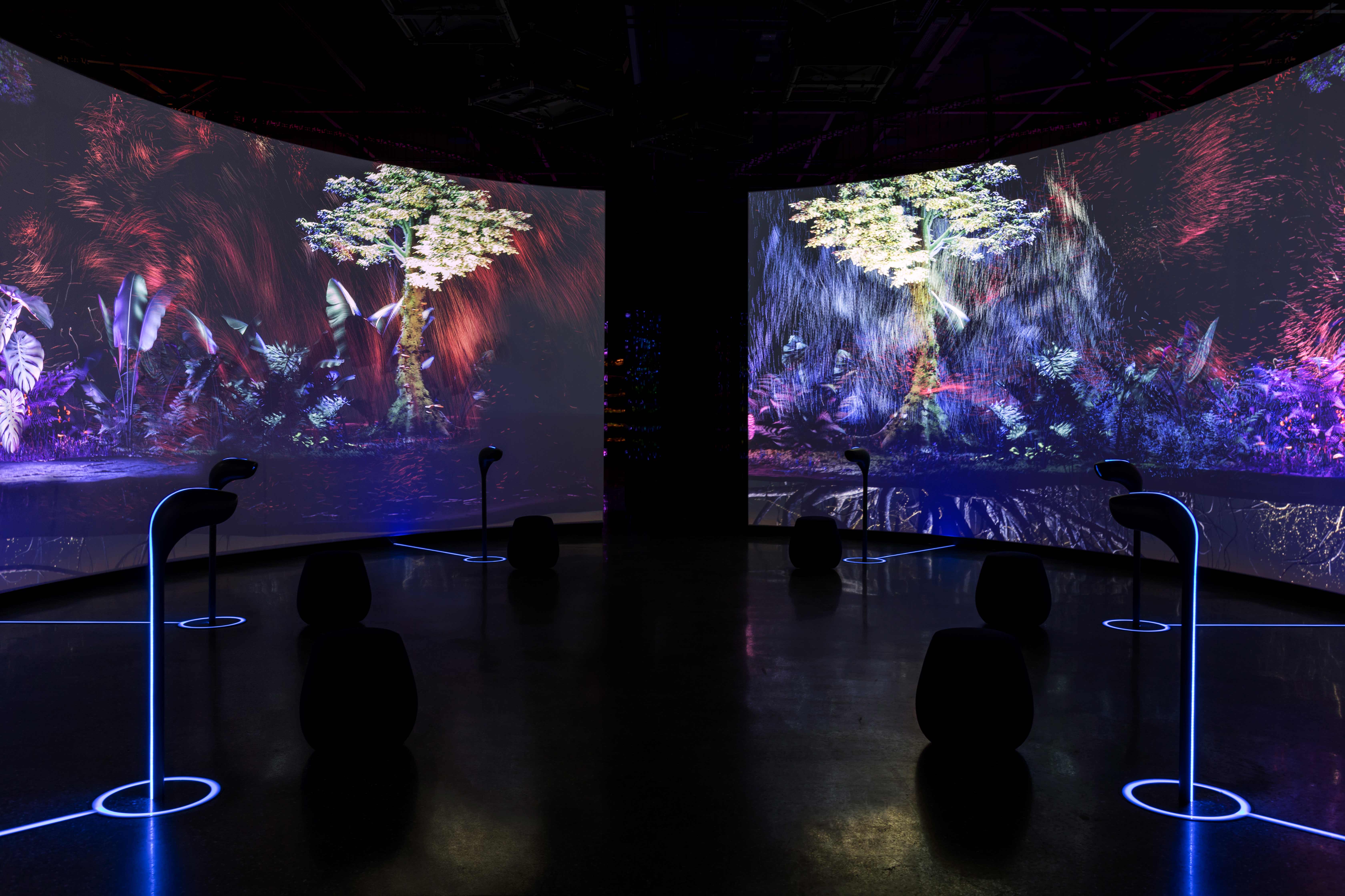
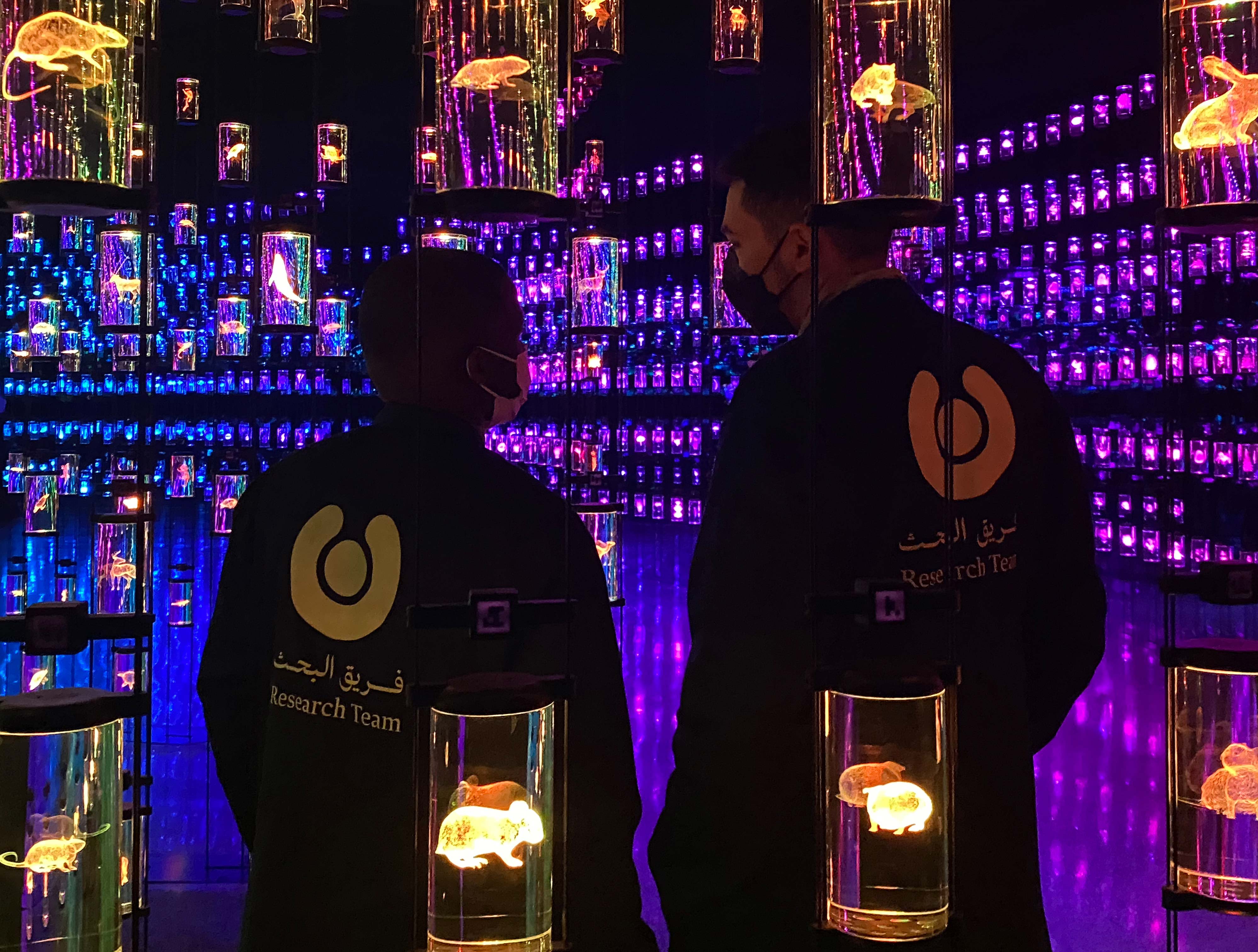
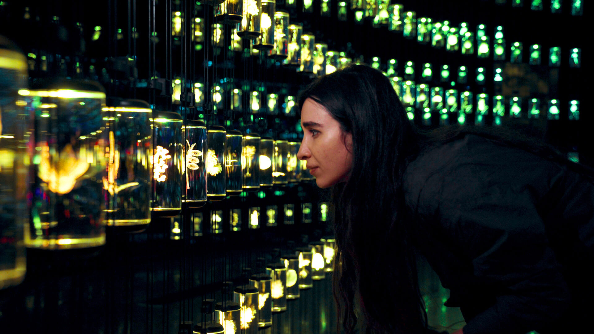
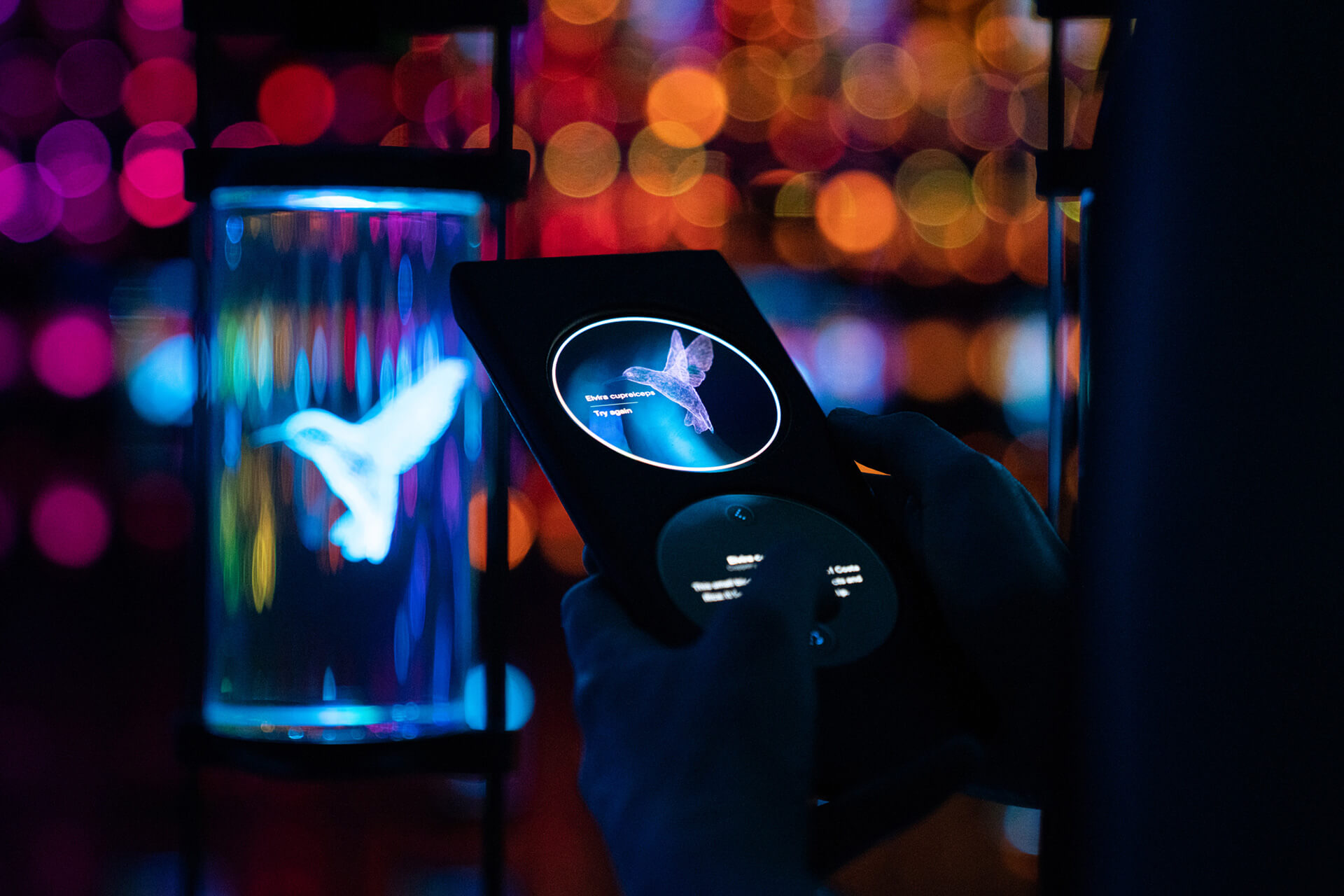
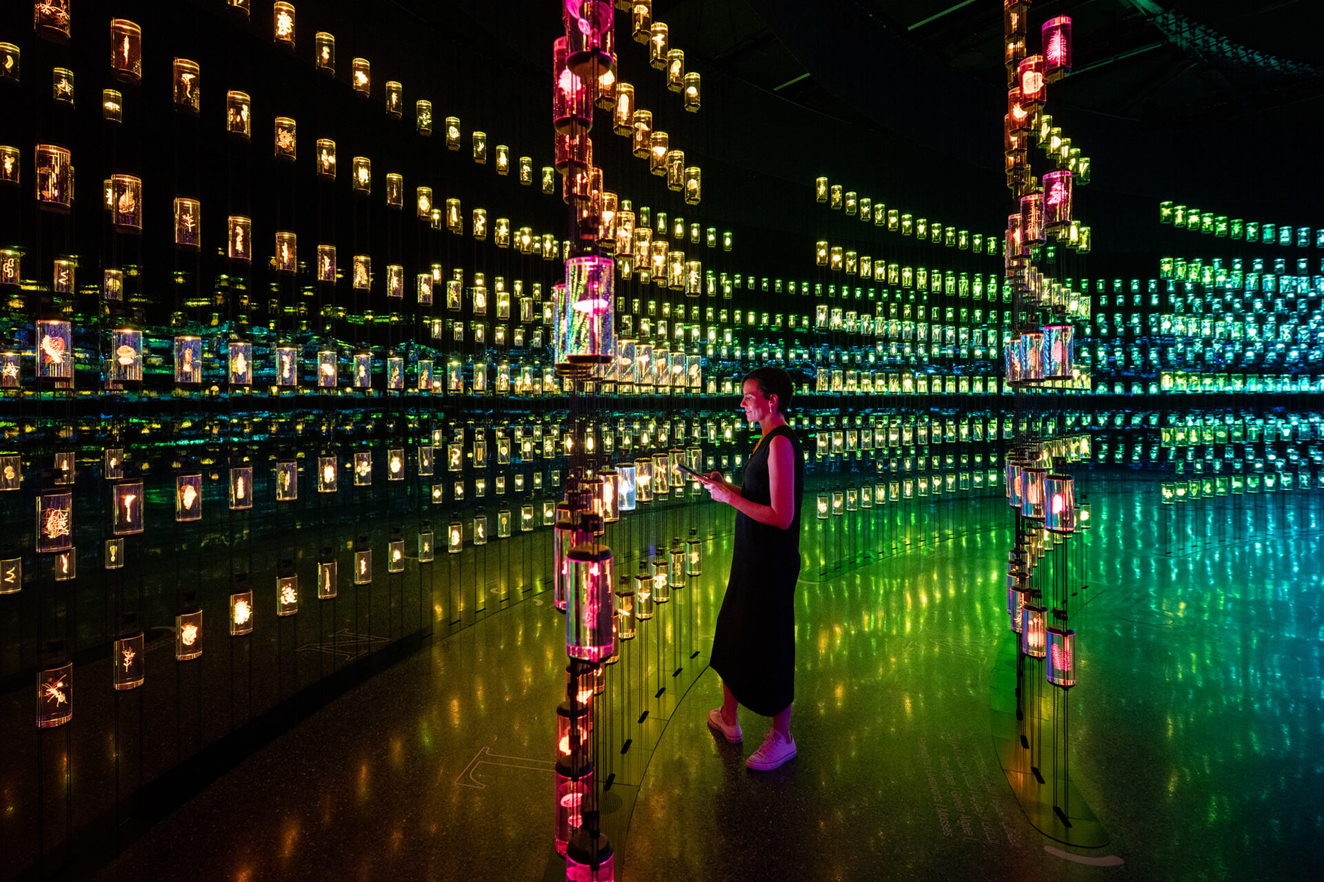
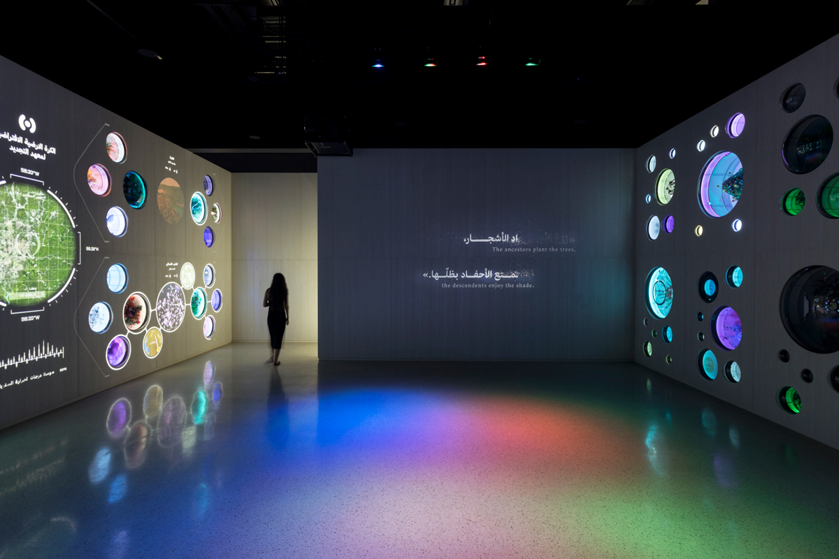
The heal Institute is a space in the Museum of Future where the visitors contribute to the regeneration of damaged ecosystems through bioengineering. “They get immerse in a mixed reality recreation of the Amazon rainforest. See the interplay of hundreds of species and observe details invisible to the naked eye.”
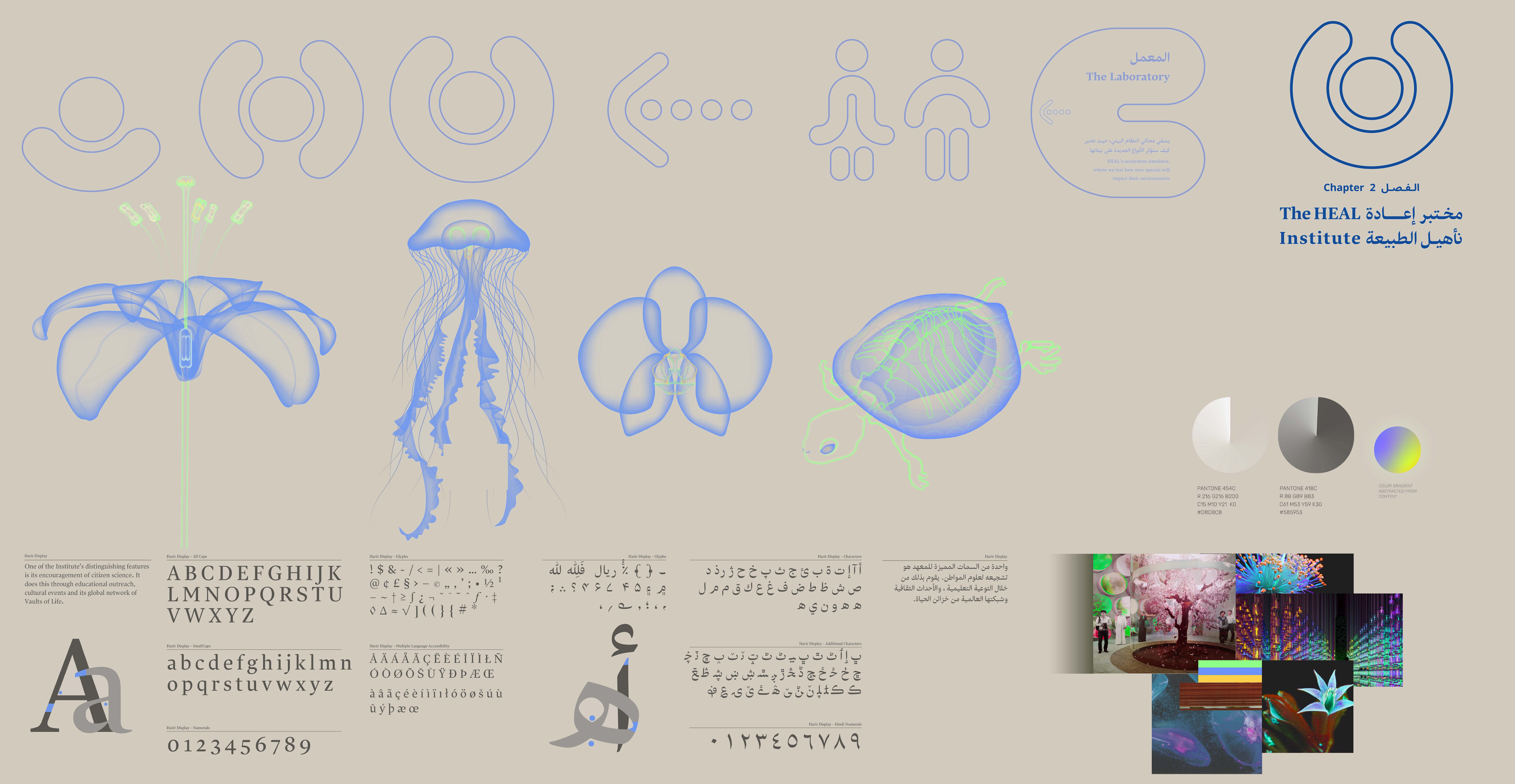
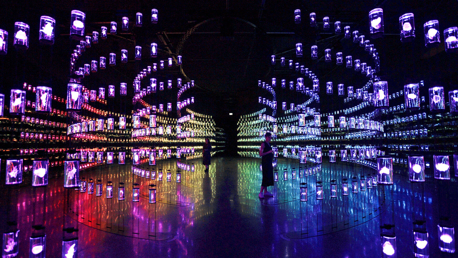
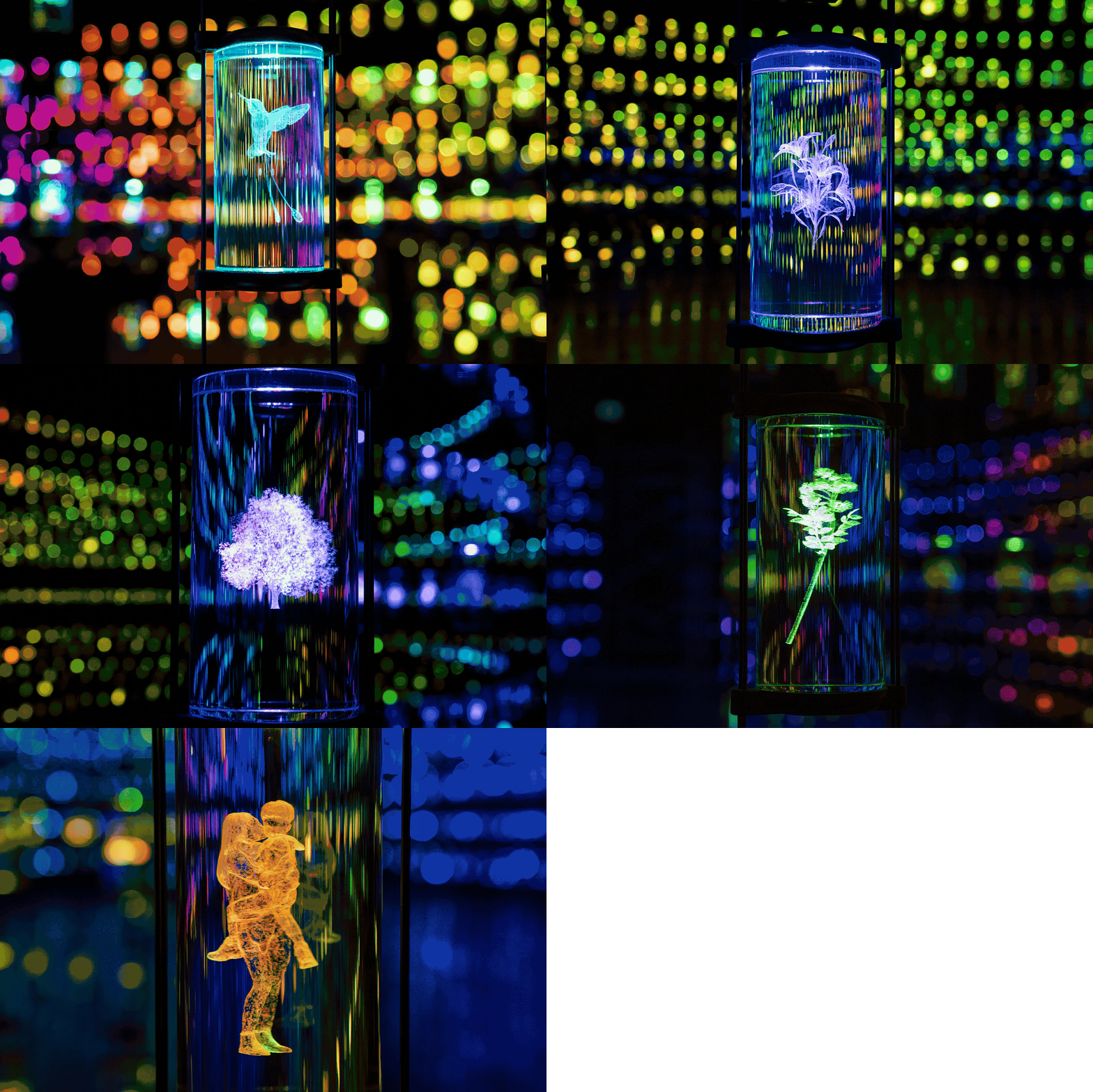
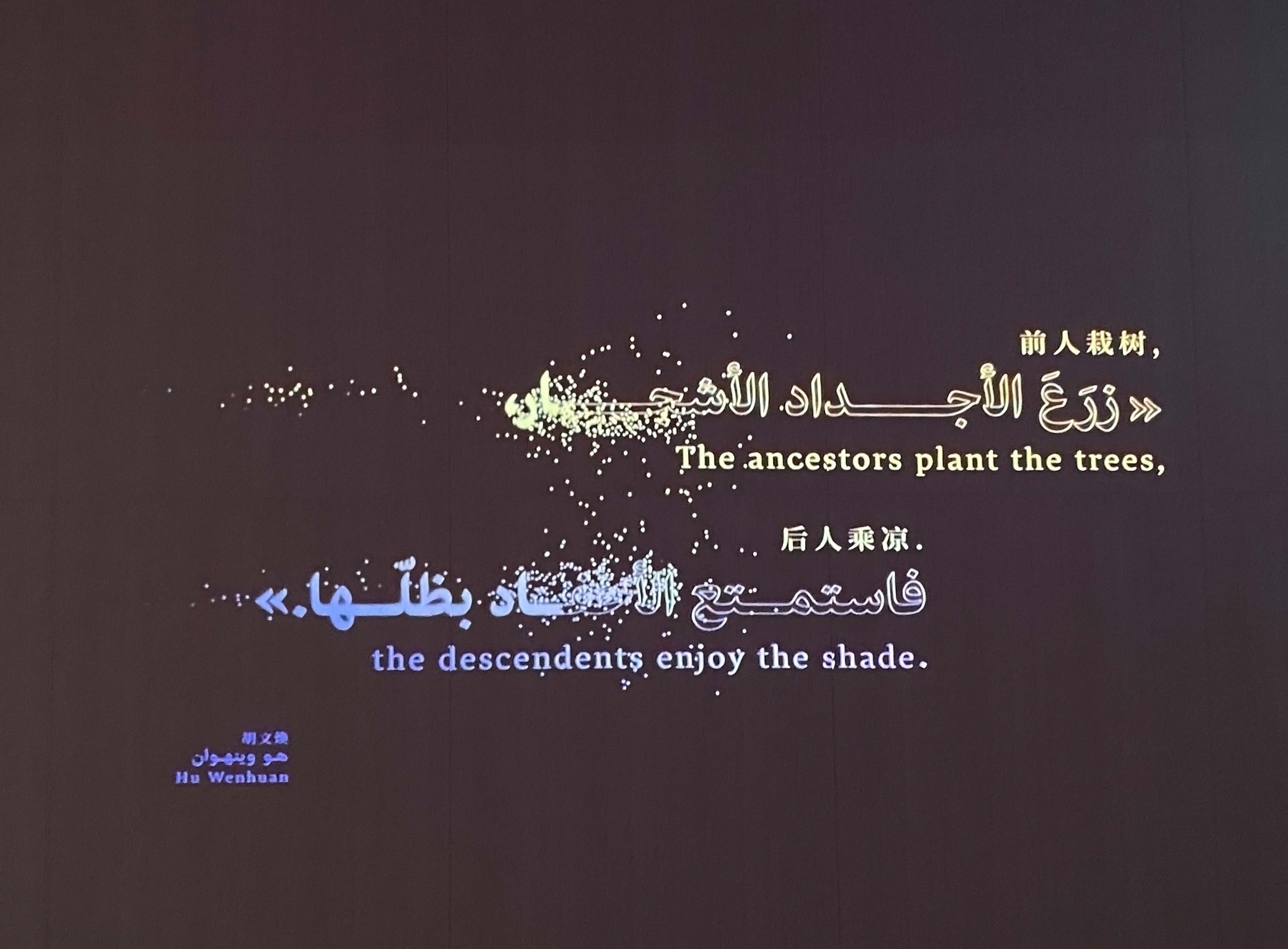
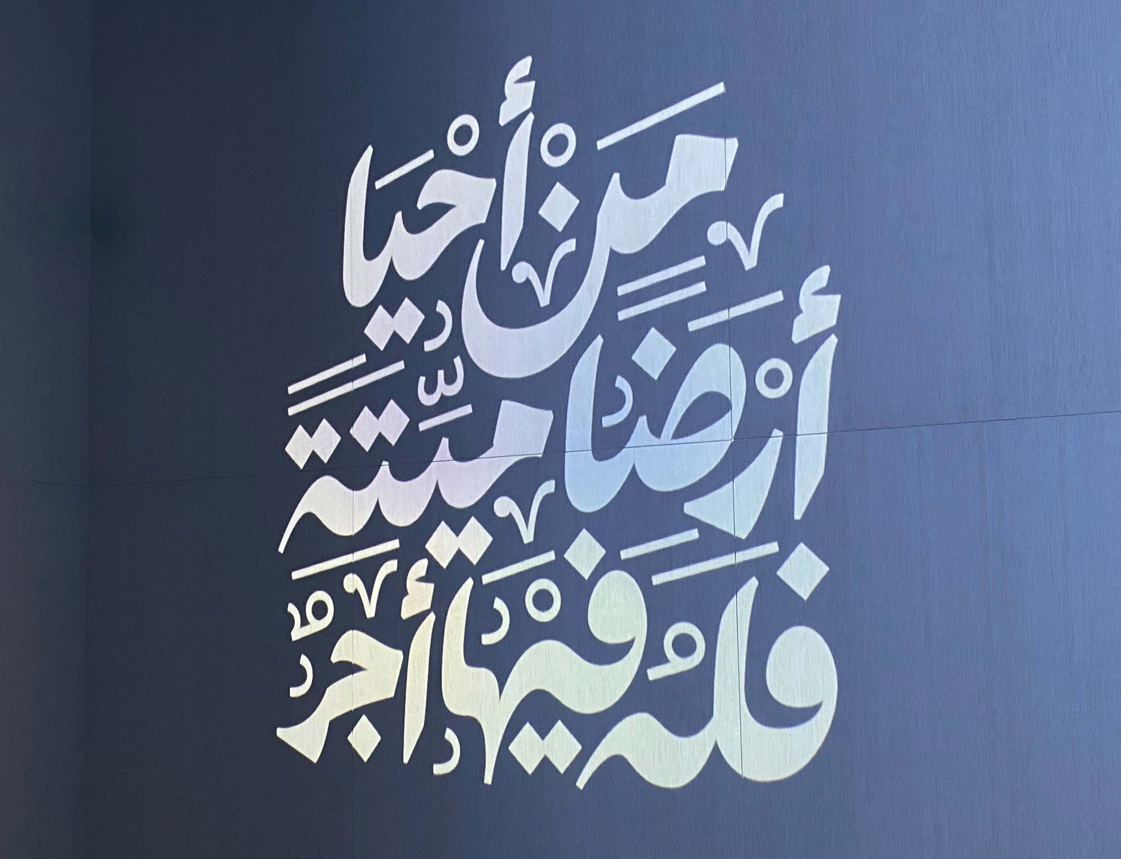
The Visual Identity of the HEAL Institute is built around sustainability and energy-saving principles. The typeface is designed to use less ink in print, and the dark interface design is intended to save energy through different biongineering devices. The color palette stems from the flora and fauna of the UAE, with a fluorescent touch insinuating the human intervention. The transparency and porosity of the illustrative style showcases the institute’s commitment to the examination and investigation of organic life, its beauty and complexity.
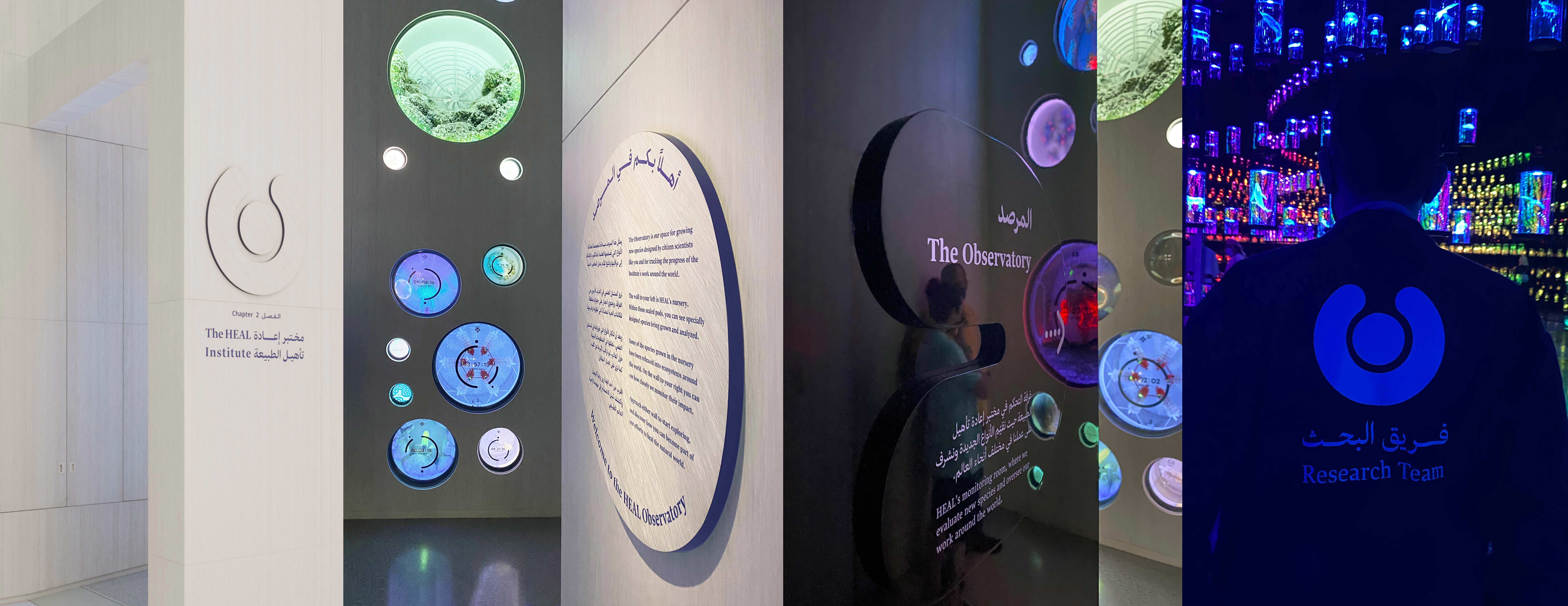
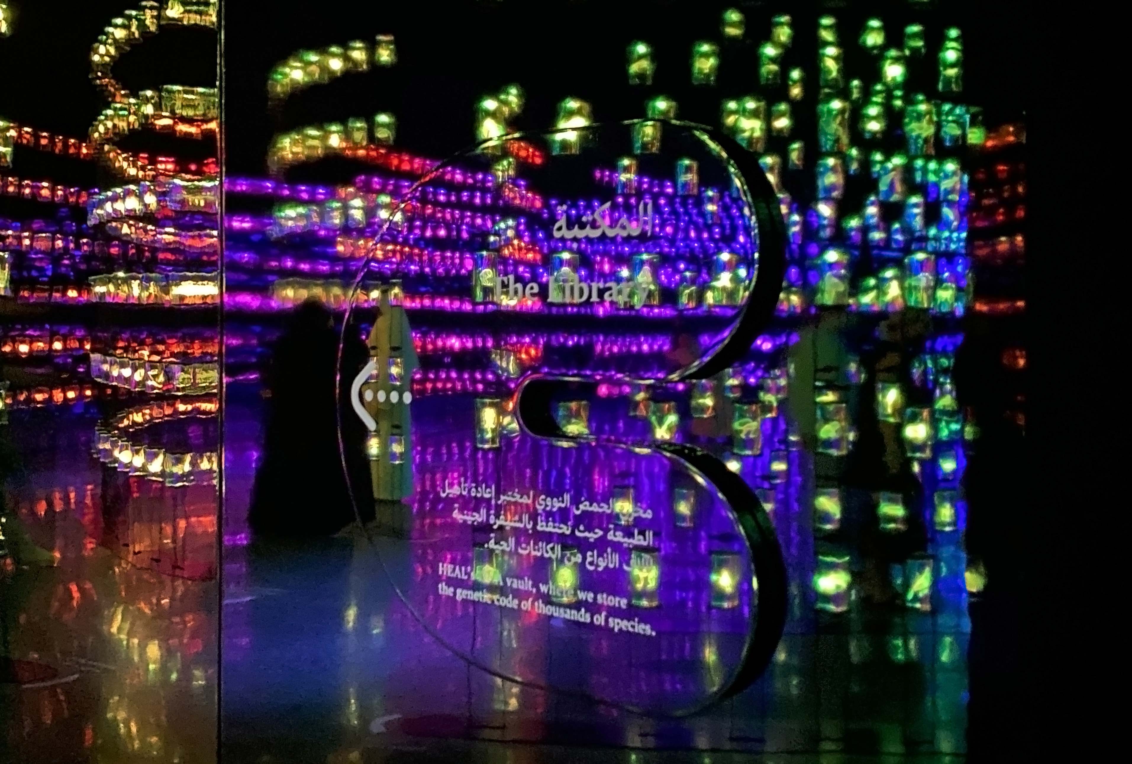
The visual identity was implemented by the media designers in the UI and UX digital interactives and immersive media installations in space, as well as in linear calligraphic animations , signage, wayfinding, and exhibition graphics developed by our team internally.
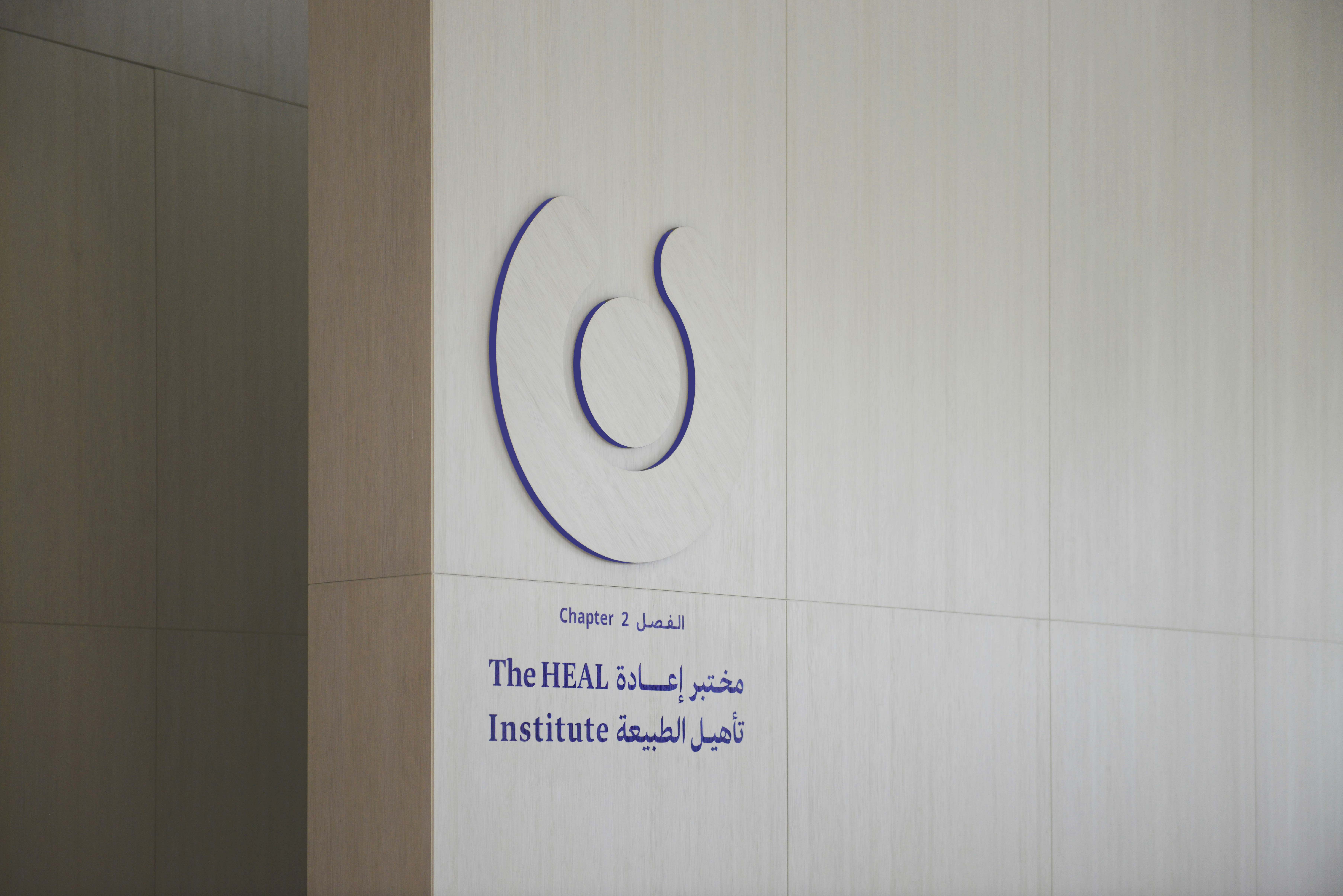
Signage and Wayfinding, Exhibition Graphics, Visual Identity
General Planning, Exhibition Planning, Scenography, Graphic and Media Planning ATELIER BRÜCKNER | Calligraphy with Khajag Appelian, Kristian Sarkis | Light Planning with Belzner Holmes | Media Hardware Planning with medienprojekt p2 MEP | Media Design and Media Production Certain Measures, Marshmallow Laser Feast, Superflux Photography Giovanni Emilio Galanello/Sandra Ciampone
