All posts by rana rmeily

The Ephesus Experience Museum

Architectural Concept | Wassim Melki
Experiential Design, Visual Design & Narrative | Rana Rmeily, Wassim Melki, Christine Eicher in Collaboration with Marshmallow


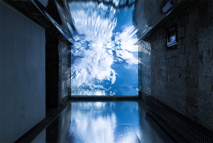
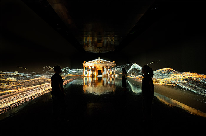
This immersive installation within Ephesus’ archaeological site revives its vibrant past, blending myth and reality to unveil the city’s former glory. Crafted by a collaborative team, including architects, designers, and historians, it transports audiences into history. Using cutting-edge technology, visitors experience Ephesus’ magnificence and witness its birth, the rise of Artemis, and the opulent Roman lifestyle. The experience offers a 360-degree immersive film, holographic AR projections, and spatialized soundscape to engage visitors emotionally and educate them about Ephesus’ history. Through sensory tools like scent diffusion, light design, and fog, visitors are transported to the past, while a multi-language audio guide ensures a seamless journey.

Çinili Hamamı

Experiential Visual Design Direction: Rana Rmeily
Media UI/UX, Exhibition Graphics, Branding Revamp, Web Design, Signage & Wayfinding  | Lilian Lautenschlaeger & Rana Rmeily with the support of Aliena Koep, and Andreas Berzdorf


The meticulously restored  Zeyrek Çinili Hamam  in Istanbul’s historic Zeyrek neighborhood now serves as a cultural center, offering a blend of traditional bathing, museum exhibitions, and event spaces. The exhibition, divided into four themes, guides visitors through the building’s history, technical water systems, Iznik tiles, and bathing culture. Media installations provide an immersive experience, showcasing the tiles’ beauty and transporting visitors to Ottoman bathing history. Two large projection-mapping displays augment original fragments, while an interactive app enables time travel to when the hamam walls were adorned with Çinili tiles. Motion-tracked interaction in  The Bathing Culture Gallery reveals animated scenes. Additionally, we revamped the hamam’s brand, featuring vibrant blue palettes, custom typefaces inspired by Çinili tiles, and Ottoman miniature-inspired graphics across platforms like the website, exhibition graphics, signage, and digital media, offering a glimpse into Ottoman bathing culture.

Enigma

Media UI/Ux and Exhibition Graphics  |  Sami Karam
with the support of Aliena Koep, and Andreas Berzdorf


The Enigma Museum in Copenhagen probes cultural institutions in the digital age with its exhibition on communication. Visitors embark on a journey through the past, present, and future of communication. The first space explores Communication in Crisis, addressing encryption, surveillance, emergency protocols, and alternative truths. Visitors actively participate in communication debates and contribute digitally. The second space, Ideas that Connect Us, delves into telegraphy, wireless communication, radio, television, mobile telephony, and the internet. Hands-on activities and interactive labs inspire innovation. With a flexible exhibition system, as well as in world immersive spatial reconstructions and digital interactives, the museum engages, explores, and fosters learning in an era of mass communication.

This is Not a Flag

THIS IS NOT A FLAG. An intervention, a provocation in collaboration with @galeriekernweine @ g —— k Foto und Raum with our collective @thelovetriangle.love

Probing national symbols and how they evoke specific national values and patriotism, this intervention examines the concepts and honor-related emotions people associate with their national flag that in some cases create more rifts and separation instead of bringing people together.
Egalitarianism and unity are separable from concepts of nationalism enabled by symbols such as the flag.
Using the same medium to question it, we raised a flag that doesn’t want to be one, far from earthly conflicts, at an altitude of 44,000 meters witnessing our fragile pale blue dot that we all exist on in this vast cosmos.
In the hopes of provoking a question around the need for such symbols, even when viewed up close.

Future Heroes

Media UI/Ux and Exhibition Graphics  | Sun Young Oh, Sayaka Koike, Sami Karam


“Future Heroes is Museum of the Future’s dedicated space for the children. Within an open world of exploration and play, children are encouraged to develop future-proof skills that will always be useful. The exhibitions three main experiences: Imagine, Design and Build present children with opportunities to play and to learn through activities that encourage communication and collaboration.”

Children are naturally inquisitive and imaginative creatures, which is why we set off on having a visual identity that is both accessible and playful at once. We created a color palette that would be fun for children to explore, without being overwhelming. The use of neon colors is a subtle way to add interest and contrast, while still keeping the overall palette subdued. The selected typefaces LL Typ 1451 in English and Teshrin in Arabic, are both quite accessible and legible, with infant As and simple Gs to facilitate legibility for younger audiences. The clean simple lines and fill illustrations help create an illustrative style for children that is both easy to identify and relatable especially linking to superhero avatars that they have to choose and embark on a journey with.

The full visual language was applied on exhibition graphics, signage, and the full UI of the digital interactives and immersive media interactives in the space.

AlWaha

Exhibition Graphics | Sayaka Koike, Sami Karam, Sun Young Oh


“This space in the museum of the future gives a glimpse to the visitors on the future of wellness. They travel to a sanctuary from digital life and explore a center for the human senses, where they are encouraged to disconnect from technology and reconnect to their mind, body, and spirit.”

As the main aim of the wellness space is providing a multi-sensory experience to commune with our bodies, the color palette borrows from human skin tones and expresses itself across the spectrum of pale pinks to dark browns.
The typeface selected was designed based on the human movement, particularly dance.
The illustrative style has its roots in skin textures, organic shapes, thermography and continuous flowing lines and patterns representing the energy of life and the interconnectedness of all things. Whether it’s used to depict the human form or the natural world, the illustrative style always manages to inject a sense of life and energy into its artwork, thereby representing  our connection to the natural world and our place in it.

OSS Hope

Exhibition Graphics  |  Sayaka Koike, Sami Karam, Sun Young Oh


“Voyage to a space station 600 kilometers above the earth  at the Museum of the Future.  Explore the space station and learn about the community of Pioneers living and working there. Observe the missions they undertake, study the things they invent and discover, and gaze upon the inspiration for it all – our beloved planet Earth.”

As OSS Hope is focused on low-impact living and efficiency, the color palette was developed across all digital interactives with dark themes and UI surfaces, thereby conserving battery life by reducing the use of light pixels aboard the station.
The typographic and illustrative style is all about simplicity. The idea is that by using simple forms and shapes, all the pioneers on board can communicate more easily. The typeface used for all signs and labels as well as the UIs is Noto, allowing for more than 800 languages for communication. As for the illustrations, they’ve been simplified to the bare minimum, in order to make them more accessible and readable.

The visual identity was implemented by the media designers in the UI and UX digital interactives and immersive media installations in space, as well as in the  signage, and exhibition graphics developed by our team internally.

The Heal Institute

Exhibition Graphics |  Sayaka Koike, Sami Karam, Sun Young Oh


The heal Institute is a space in the Museum of Future where  the visitors contribute to the regeneration of damaged ecosystems through bioengineering. “They get immerse in a mixed reality recreation of the Amazon rainforest. See the interplay of hundreds of species and observe details invisible to the naked eye.”
The Visual Identity of the HEAL Institute is built around sustainability and energy-saving principles. The typeface is designed to use less ink in print, and the dark interface design is intended to save energy through different biongineering devices. The color palette stems from the flora and fauna of the UAE, with a fluorescent touch insinuating the human intervention. The transparency and porosity of the illustrative style showcases the institute’s commitment to the examination and investigation of organic life, its beauty and complexity.

The visual identity was implemented by the media designers in the UI and UX digital interactives and immersive media installations in space, as well as in linear calligraphic animations , signage, wayfinding, and exhibition graphics developed by our team internally.

Tomorrow Today

Exhibition Graphics |  Sayaka Koike, Sun Young Oh


‘Tomorrow Today’ is an ever-evolving showcase of innovations at the Museum of the Future. Made in collaboration with public and private partners from around the world, this exhibition explores how designers, researchers and corporations are responding today to our most urgent challenges.”

The developed visual identity was implemented by the media designers in the UI and UX digital interactives and immersive media installations in space, as well as in signage, wayfinding, and exhibition graphics developed by our team internally.

NARC

Media UI/Ux and Exhibition Graphics  |  Sayaka Koike


The exhibition scenography revolves around a storytelling band on one hand concealing all what deflects the visitors from the vestiges of history, and on the other, allowing the guides to activate multimedia immersive content that interprets the different finds and time periods, as they transport the visitors on the guided journey through the Iberian-Punic, Roman, Visigoth, Islamic, medieval and Pombal eras.

The band is fully controlled with a customised application implemented on a device that the guide carries throughout the tour. Starting with the prologue, the application allows the guide to activate a showcase, reveal the artefacts, and animate a media wall simultaneously. This informs the visitors about the time periods and the artefacts displayed in that context and introduces the site the visitors are about to explore. Descending into a softly lit archeological underground site, the guide similarly animates the space, activates projections, sounds, backlit graphics and object labels while crossing the space, all concealed behind the band or attached to the catwalk.

See Yourself Window

The “see yourself window” is an established UI feature for all video conferencing platforms. It also took quite a big importance even before the COVID-19 virus, where people as public figures, influencers, employees in offices, lovers, etc., made sure the “see yourself window” is portraying the best image of themselves with the best light and surrounding. Some even went as far as buying special add-ons to enhance their appearance in this window.

However, in the past months, video-telephony became the only means of communication and interaction, thereby, imposing for a longer period our continuous presence as an additional person to converse with. The self became very important in the connections and exchange with other people.

Evidently, us re-integrating in physical social interaction rather than virtual, necessitates an intermediate step that eases us into the in-person interactions and to the absence of the possibility of us observing ourselves.

Which is where the see yourself window augmentation gadgets came to be. Available in round as well as rectangular shapes emulating the virtual see yourself window, these gadgets offer the possibility for your friends and family to ease you again into physical interaction by allowing you to see yourself while conversing with them through these easily attachable 3d printed mirror add-ons, customizable to each person’s ear size.

Crafted to yoke perfectly with the face, the fixation on the ear is seamless and comfortable, and the gadgets are light weight and can be worn for long periods of time. That and, one of the 3d printed models offers the possibility  to adjust the mirror tilt to match the person-people facing you for them to better see themselves.

The Nobel Prize in Literature

“Sharing Worlds” the Nobel Prize in Literature, is one of a series of traveling exhibitions that were developed in the past four years at Atelier Brueckner for The Nobel Foundation in partnership with the MBRF foundation in Dubai, UAE.


Literature is the art of expression through the written word, it describes the world around us and our own inner being, tells stories, conveys insights and emotions, and provides understanding and context. 

To communicate this rich thematic to a relatively young crowd, we developed at Atelier Brueckner, an  exhibition around eight key novels. Each representing a certain theme such as love, peace and family, and translated spatially through four star-shaped media pillars. 

Each pillar illustrates the novel and the respective theme through films, animations, audio excerpts, and interactive art pieces. It offers an introduction to the theme as well as the selected book, a bookshelf with other works and the possibility to visualize them through interactive RFID stations, and finally art sculptures developed by different artists translating the novel into visual content that visitors can activate while listening to audio excerpts.

Anonima Plastica

“Anonima Plastica” narrates an anonymous design, in particular an object which doesn’t define any specific temporal or physical context.


Disconnected from its surrounding, this object works as a time-space-machine: it shows us how shared -public or private- space can be generated anywhere anytime by means of a simple element, becoming meanwhile a witness of all the design scattered around the world.
The Illustrative work, publication, photographic documentation and installation displayed as part of Fuori Salone are based on a research carried out across Lebanon by thelovetriangle collective, sitting on this time-space-machine to look back at the transformation the country went through for the past 30 years.
Where do objects we use come from? What happens when we do not use them? What will remain of mankind after mankind?

The Love Triangle Gallery

TheLoveTriangle off-grid pavilion in Baabdat, Lebanon, was designed by Wassim Melki and myself to provide its members with a space for experimentation, exhibitions and art residencies.

The aim was to create a peaceful space, a gesture, not competing with the surrounding landscape. Therefore, the design of the pavilion was stripped down to a pure and primitive architectural form: A rectangle of 96 sqm, discreetly nested in a clearing between the pine trees.

The open plan, flat-roofed structure is reminiscent of the traditional and modest stone construction typical of Mount Lebanon prior to the introduction of more complex design elements in the midnineteenth century (I.e. Central hall, arcades, pitched roof etc. Speculatively attributed to a Tuscan influence) and features a simple metallic ladder on one of its facades.

The existing retaining stone walls had to be reinforced to be used as foundation, and in order not to disturb the natural setting, the construction was mostly off-site. Four Pre-cast concrete modules were lifted over the trees with a mobile high-boom crane to their final position. The resulting modular open plan gives full flexibility for interior installations, and large glass windows frame the landscape. Reciprocally, the interior spaces are framed from the outside, creating intertwined exterior-interior opportunities.

The Love Triangle

One, two, and three…The bowl, the soup, a spoon…You, me, and them. Me, myself, and I, stand in a delicate relationship.

The love triangle questions this relationship, with a curiosity to the rhythm of ephemeral bodies interacting, the decadance of images, and the consumption of space. The research started in 2017 in Stuttgart, where two wandering points connected, and are always looking for a third  (interchangeable) interlocutor to build new dialogues.

The Nobel Prize in Chemistry

How to become a Nobel Prize Laureate? The traveling exhibition ‘Connecting Elements – The Nobel Prize in Chemistry’ familiarises young people with the laureates in chemistry and their groundbreaking discoveries. Manifold hands-on- and media stations are intended to engage the visitor in taking action to research and explore. The visitors discover four different thematic areas and learn how chemistry influences the environment and our everyday life. Main target group are children and adolescents 12 years and older. By issuing a personalised document and a photo of the visitor at the award ceremony in Stockholm, which are sent by e-mail, the exhibition connects the visitors to the Nobel Prize and creates an unforgettable visitor experience.

Stretching Spaces

This installation at Galerie Kernweine, reflects on the elasticity of spaces in our individual and collective memories. “An immaterial space within the gallery walls.”

A translucent membrane acting as a semi-permeable border between the public and the more private, between the real and the fictional covers the space. A peep hole allows the visitors to peak into an acoustic live installation-performance by les six.

In the cellar, the visitors are transported into outer space through a live immersive projection of the earth as documented by the international space station, which is in turn subjectively interpreted in two other spaces.

The Nobel Prize in Physics

Discover the world of Physics in a playful way: the exhibition area, designed in dark blue colors with light and shadow, offers eight open, themed stations, which invite to interaction. In the area ‘Rays & Waves’ young visitors can zoom into the insights of the human body. In ‘Matter’ they can understand the composition of an atom and in ‘Electronics“ electronic elements can interactively be connected. ‘The Stars and the Universe’ takes them finally to an interactive journey to the stars. The exhibition is intended to awaken curiosity into exploration of microcosms and macrocosms, showing how the discoveries of Nobel Laureates in Physics have had an impact on our lives. The ‘Laureates Trial’ offers detailed information about the single Nobel Laureates: 20 stations with iBeacons are distributed in the exhibition space and can be unlocked by approaching them. An overview of the Nobel Prize in general and its donor Alfred Nobel provides the prologue area, where the long tradition of Physics in the Arabic world is exhibited as well.

HUGO BOSS Bespoke Collection

Video activation  for HUGO BOSS  Bespoke Bag Collection


A cult-collection requires a cult-representation.
The BOSS BESPOKE collection oozes with character and charm, which was communicated in the special feature that I developed at STAN STUDIOS.

Strong colours, dynamic lines, and elaborate animated patterns come together to form an immersive polychromatic kaleidoscopic universe, all while portraying the precision and fine florentine craftsmanship.

The Nobel Prize in Biology

The exhibition ‘Exploring Life – The Nobel Prize in Physiology or Medicine’ in Dubai’s Children’s City takes visitors onto a playful journey into the world of medicine: It deals with diseases and their cures, anatomy, the cell, DNA and with ways of making the invisible visible. The young visitors can assemble a huge DNA-model, interactively explore a cell via a projection on the floor and they can zoom into the inside of the human body on media tables. The spatial installations are accompanied by findings and quotes of the Nobel Laureates. The prologue area features a chronological overview of the history of the Nobel Prize and the long tradition of Arabian medicine.

Our team at Atelier Brückner developed the media interaction UI UX as well as the full exhibition graphics in space.

Desoto

Desoto is a flexible shirt brand.
We developed at Stan Studios a re-vamp of key brand applications such as the shirts new innovative retail-packaging.
The full approach aims at staying true to the brand’s core values, while revamping key visual features.

Who says that shirts must be displayed on a hanger? Desoto’s unique shirts and blouses are presented in an innovative box, where things are wrapped up in.
An approach that catches eyes, but also perfectly emphasizes the product’s USP of being wrinkle free. Displayed in a highlight-pillar for the POS instant interest is guaranteed.

We also developed several promotional trade fair layouts and setups for the brand in Berlin Fashion Week.
Featured below the: Fall / Winter  2017
The main approach was insuring the shirts key characteristic – Flexibility – stands out.