All posts by developers

RAYXANDER

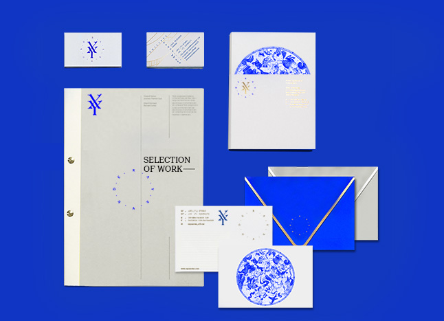
Brand identity for RAYXANDER a multidisciplinary design studio fascinated by creation, mutation, and evolution in its design process, London–2015.


RAYXANDER’s story is told through its mark; the letters “X” and “Y” come together to form a starting point where time and space are flattened  forming a platform for new creations inspired by the rebirth process, the geometry that makes life, the forms created by patterns of movement and its unpredictable outcome.

All these elements are also translated in the identity forming a design scheme composed of a number of core elements such as the mapping graphics with medieval visual queues highlighting the “journey” concept  from the time Copernicus imagined a heliocentric world with the sun-RAY at the centre. The sun, is the point of origin for all of its creations.

ROHD

Branding for, Roland Helou Design (ROHD), a Beirut-Based interior architecture and multidisciplinary design studio.


The full branding project from identity and naming to web and digital presence to spacial and environmental branding, is aimed at highlighting the pragmatic, functional, and minimal perspective that ROHD studio adapts in the projects it tackles.

LK/LARA KHOURY

Online experience for LK, a Lebanese fashion designer renowned in her bold, moving, and  experimental style, making her fashion interventions sometimes more of art pieces.


Lara’s work, and the daring attitude she adopts influenced the creation of a site with an artistic statement, rather than a  simple profile.
It presents the collections/art interventions as meshes of influences, styles, experimentations. Clicking on a mesh would allow you to discover more.
The website is currently under construction and will be launched this coming November.

AL’ANBIQ

Al’Anbiq is a personal project/product launched by Wassim Melki and myself, after having spent quite some time in home distilling the Lebanese famous spirit “Arak”.


AL’Anbiq is a craft Arak, envisioned to be produced in the Mount lebanon village, Baabdet using the finest grapes from the Bekaa valley, and then aniseed from the Al Heenah area of Mount Hermon (considered the finest anise in the world). The spirit is distilled to release the purest arak, which is then  to be aged for two years in clay jars.
The branding highlights the modest and crafty nature of this spirit.

videoworks

Promotional Pamphlet for Ashkal Alwan‘s Video Works screening platform, aimed at supporting the development, production, and diffusion of new projects by emerging artists and filmmakers working and/or residing in Lebanon.


We created a comprehensive clear bilingual promotional pamphlet for the event.

WORLD COSMETICS

Brand identity for womens’ cosmetic line World Cosmetics, Lebanon–2013. World cosmetics differentiate from competitor brands through its range of products that combine some of the healthiest and most natural ingredients.


The branding and packaging system for the first release of World Cosmetics, features a logotype that highlights the lightness and refinement of the products. The geometry and cleanliness of the marque (based on the History typeface), helps also in communicating the historical background of the brand and position the products for a female audience.


MARIPOLARAMA EXHIBITION

Instaleb is a personal initiative developed by Wassim Melki and myself, in the aim of reintroducing polaroid photography to the Lebanese market by providing vintage refurbished polaroid cameras as well as the Impossible Project polaroid films.


The  MARIPOLARAMA exhibition features a selection of Polaroid photographs by New York-based French artist Maripol that span a genuine who’s who from this legendary period. Photographer, stylist and filmmaker of Lebanese origin.
The exhibition also includes an installation displaying the polaroid cameras across the years and their evolution. These cameras are made available by Instaleb to the Lebanese public.

THE DIALOGUE IS US

Book design of ” The Dialogue that is Us” by Tony Chakar, Lebanon–2013.


In 17th century Europe, “emblem books” were quite common, and they mainly spoke of the end of things, of a failed world and its defeats. Everything became an allegory, where the image was not an illustration of the text and the text was not a caption for the image.

The Dialogue That Is Us takes emblem books as its point of departure: from the wreckage of History, images are seized and transformed into allegories that illuminate the present of a world (the Arab World) that did not produce them. But then again, in the wreckage of History, strange affinities arise form between things, no matter how remote.

KATHARINE HAMNETT

Katharine Hamnett Per Solidal line, Promotional Campaign, Milano–2012.


Katharine Hamnett who has been always famed for her ecological and environmental approach in fashion joins forces with Coop Italy to produce an affordable fashion line. We at Young & Rubicam created a campaign using nothing other than the strong messaging in Hamnetts designs such as “together it is possible”, “and stop and think” to highlight this sustainable eco-fashion collaboration and its positive outcome.

beirut wonder forest

Beirut Wonder Forest is an environmental initiative on a city scale launched by Wassim Melki and myself in Beirut–2012


Beirut is a concrete and pollution mayhem and there is a huge lack in green spaces. Therefore, given the circumstances, our initiative came to be by suggesting that each building grows its own rooftop garden.
Nothing fancy, just a couple of trees in a large fixed pot on each rooftop. The municipalities offer tax reductions or benefits to the buildings that have a well maintained rooftop garden, and the gardening/plant companies could offer discounts and sponsorship.
Ultimately, the plan was to have beirut as a rooftop wonder forest, but the initiative managed to be applied on 40 public schools in Beirut through governmental support and funding.

TO BE HUMAN

International poster contest “To Be Human” Aarhus, Denmark–2012.


The Danish Poster Museum invited to an open international poster contest where poster artists from all over the world, create new original posters with the theme “To Be Human” and how artist understand the concept of universal humanity.
I chose one of the symbols of perfection and distorted it in a call to highlight/embrace our flawed and imperfect humanity, reflected in the challenges we are facing in our modern day from human rights, to nature, environment, as well as wars, refugees and universal crises.

SERRALUNGA

Full Brand identity for Serralunga 1825 outdoor patio furniture line, created during the masters program at Scuola Politecnica di Design (SPD), Milano–2011.

A new movable identity for Serralunga that is in continuous change and morphing, relating to the characteristics of the brand that is always talent scouting and each product within the line is commissioned to a young designer that has a completely different identity/inspiration/and purpose.

museo leonardo davinci

Corporate identity for MNST Leonardo Da Vinci,  created during the masters program at Scuola Politecnica di Design (SPD), Milano–2011


The branding is based on the languages of science and technology. Behind every kind of language there must exist a structure that can be grammatical or aesthetically set rules. There is no language if there is no structure, just like there is no science if there isn’t postulates and theories.

We designed a main structure/skeleton from the basic non devisable shape, the triangle, and from there we built a visual language for the museum.

STORIA ABBREVIATA

Storia Abbreviata della Letteratura Portatile art book design, part of an editorial design course at SPD, Milano–2011.


The book is themed around the surrealist group Called “Shandy” and their journey around the world.
This  lead us to interpret it editorially by making an “Exquisite Corpse” book of People, Objects and Places.
Each page is the result of a casualty of events that drives to a labyrinth of equivoques and discovery.

KSARA

Promotional Campaign “Every Bottle Tells a Story” for Chateau Ksara, a leading wine in Lebanon at Leo Burnett –2011.


Throughout the years, Ksara has engaged the Lebanese people with campaigns revolving around the cork. As a result, people began to view the cork as the creative equity of the brand.
This time, to further engage people with the brand, we at Leo Burnett created this integrated campaign.
The cork has now become a communication tool, giving people the opportunity to record their memorable moments and share it with the people who enjoyed the same bottle with them.

HOMMAGE A MAURICE BEJART SHOW

“Hommage a Maurice Bejart ” is a visual show organised by  the Academie Libanaise des Beaux Arts (ALBA) at Roman Temple of Baalbeck–2009.


Fully produced and directed by the second year students.
This show is a creative spectacle combining music, choreography and colors, with an academic objective of gathering our talents and enabling us to reinvest what we have acquired during our two years of studies in the service of both a sound and a visual production.
The topic of the opus 2008 was an hommage paid to Maurice Béjart, who recently passed away, and who completely revolutionized the art of the dance. The objects that were created for over 3 months, moved and interacted with the music and lighting as if they were Bejart’s own dancers.